Event page Manager
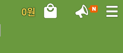
Event Page: An event page refers to each event that will be listed in the event list, accessible through the megaphone icon located in the top-right corner of the in-game screen. Event pages can only be registered in games that have already been released.

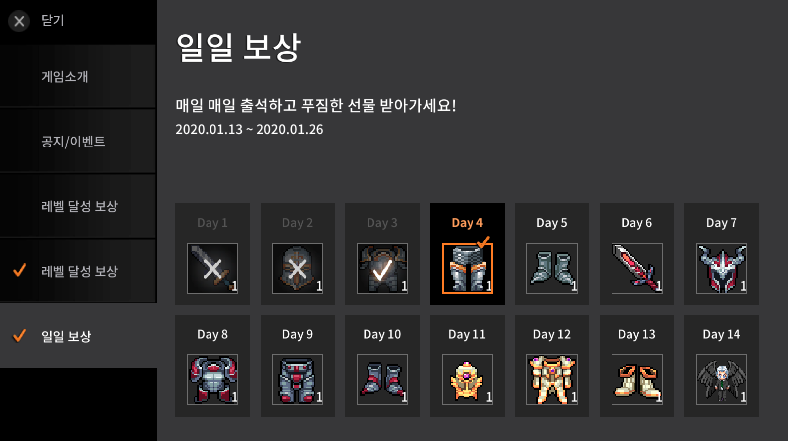
Each event page will be displayed in the form shown in the screenshot below. When a player meets the conditions specified in an event, the registered item for that event will be given to the player. In the event page list on the left side of the screen, an orange checkmark will appear on the left if there is a reward available for the event, as shown in the screenshot below.

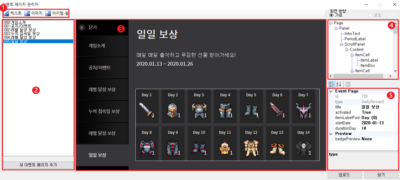
Event Page Manager: The Event Page Manager is a tool in Punkland Studio that allows you to add, modify, and customize event pages. You can access it through the path shown in the screenshot below.


UI Add Button List This button is used when you need to decorate the event page or extend the period to add item cells.
Page List View and Add/Delete You can view and select added event pages. To delete a page, you can click the Delete button only for events that have ended. By clicking the button at the bottom, you can select the desired template to add an event page.
Page Composition Preview and UI Selection, Movement, Size Adjustment This area allows you to preview the constructed page. You can select each element to move and resize it by clicking on it. If multiple elements are overlapping, the UI without a child (at the bottom) will be selected first. Additional clicks will select the higher-level UI.
Page Composition Elements (Page and UI) Tree View The composition elements consist of the event page itself (top level) and the UI elements that are dependent on the page. Detailed explanations can be found in the event page components and customization section at the bottom of this tutorial. You can check the parent/child relationships of each element. For data related to position and size, using percentage values will affect the parent UI’s position and size.
View and Edit the Selected Component’s Properties For the event page, you can edit the event name (title), activation status (activated), item label format (itemLabelFormat) for reward conditions, event start date (startDate), and event duration (durationDay). For non-event page components, you can edit values such as position adjustments.
How to Add an Event Page
You can add a new event page through the Add New Event Page button located at the bottom left of the event page manager. To make it easier for creators to add event pages, we currently provide 3 templates:
Daily Reward: Players can receive rewards every day starting from the event start date. Rewards for past days are not available.
Level Achievement Reward: Players can receive rewards when they reach a specific level.
Cumulative Login Day Reward: Players can receive rewards based on the number of days they log in during the event period.

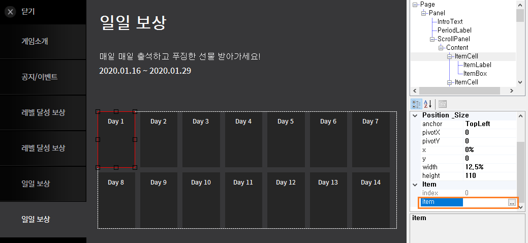
After adding an event page, click on each item cell (the area marked with a red line) to select it. Then, in the area marked with an orange line on the right, you can register the items as rewards. Once you have completed the item registration in the required item cells according to the template, you can apply the added page to the currently live game immediately by clicking the Upload button at the bottom right of the Event Page Manager.
Event Page Components and Customization:
When creating an event page through each template, you can immediately upload it after registering the required items in each item cell. However, if you customize components like the event name, event description, etc., it will help differentiate your game and enhance player immersion.
Each component can be customized through:
3. Page Composition Preview and UI Selection, Movement, and Size Adjustment
5. Viewing and Editing the Selected Component's Properties
Event Page (Page)
You can set up the event itself:
Event Name (title): The event name shown in the event list on the left and at the top of the event page.
Activation Status (activated): Whether the event page is active. If set to false, the page will not be visible to users. You can modify this in real-time via the web console (nekoland.net/me).
Item Label Format (itemLabelFormat): The format for displaying the conditions to receive the items at the top of each item cell.
{0}will display the condition set in the item cell (e.g., level or days since the event started). Example:{0} level→ 1st level, 2nd level, 3rd level, etc. /{0}th day→ 1st day, 2nd day, 3rd day, etc.
Event Start Date (startDate): The date when the event becomes visible to users. It cannot be set to a date before the current time.
Event Duration (durationDay): The number of days the event lasts.
For date-based templates (e.g., daily rewards, login rewards), the number of item cells cannot exceed the duration.
For daily rewards, the number of item cells must match the duration.
After the event ends, the page will no longer be visible to users, and the page can be deleted.
Item Box (ItemBox)
This is the space where the item to be rewarded is displayed:
Item (item): Click on the "…" button to select an item from the item selection window, or enter the item ID manually to choose the reward.
Item Quantity (itemCount): After selecting an item, you can set how many items to give when the condition is met.
Item Label (ItemLabel)
This section displays the condition needed to receive the item:
Needed Level (neededLevel): This is only editable for level achievement reward templates. You can set the level that must be reached to receive the item.
Item Cell (Item Cell)
The UI unit that holds the item reward components:
Index (index): A non-editable value that determines the order of rewards (e.g., daily rewards, login rewards). The item’s receiving condition is fulfilled according to this index order.
Level Label (LevelLabel): For level achievement reward templates, it displays the user's current level. You can delete this label, but it cannot be added separately.
Period Label (PeriodLabel)
This area displays the event period:
{0}will display the event start date, and{1}will display the event end date. The dates are displayed in the format yyyy.MM.dd. Example: If the event starts on January 16, 2020, and lasts for 7 days:{0} 00:00 to {1} 23:59→ 2020.01.16 00:00 to 2020.01.22 23:59
Textbox (Text)
A freely addable/removable textbox at the top left of the event page manager:
text: The actual text displayed.
textAlign: Defines the alignment of the text.
textSize: The size of the displayed text. There may be slight differences between the preview and the actual in-app text size.
color: You can choose the color using the “…” button or enter the RGB values manually. You can only adjust transparency (A) through manual entry.
Image Box (ImageBox)
A freely addable/removable image box at the top left of the event page manager:
image (image): Click the “…” button to select an image from the Pictures folder in the project’s saved location.
Scroll Area - Scroll Panel
This represents the visible scrolling area:
horizontal: Whether horizontal scrolling is enabled. Default value is False.
vertical: Whether vertical scrolling is enabled. Default value is False.
color: Choose the background color using the “…” button or enter the RGB values manually. Transparency (A) can only be adjusted through manual entry.
horizontalOffset / verticalOffset: These values show a preview of the scroll when horizontal or vertical scrolling is enabled. You can input values from 0% to 100%.
Scroll Area - Content Box (Content)
This is the space where item cells are added. Only item cells can be added in this area.
For scrolling to function properly, the content box should be larger than the scroll panel, and the horizontal or vertical values of the scroll panel must be set to True.
Common Size and Position Adjustments
The coordinate system for each component in the Event Page Manager has the top-left corner as the reference point (0,0). Coordinates increase as you move right and down.
x, y: These values determine the position of each component. You can use percentage values based on the parent component's size.
width, height: These values determine the size of each component. Percentage values based on the parent component’s size can be used.
anchor: You can set the reference point for applying the component’s position to its parent.
pivotX, pivotY: These determine the origin point of each component.
Values range from 0 to 1.
0 represents the top-left corner, and 1 represents the bottom-right corner.
Positioning Examples:
To center a component in the parent, use:
anchor: MiddleCenter / pivotX: 0.5 / pivotY: 0.5 / x: 0 / y: 0
To position a component at the top-left of the parent, use:
anchor: TopLeft / pivotX: 0 / pivotY: 0 / x: 0 / y: 0
To position a component at the bottom-right of the parent, use:
anchor: BottomRight / pivotX: 1 / pivotY: 1 / x: 0 / y: 0
Last updated